The Kingston Symphony Association exists to produce and promote professional quality programs of instrumental and choral music for the education, enjoyment and enrichment of audiences in the Greater Kingston area. In 2020, BmDodo Strategic Design was tasked with rebranding the Kingston Symphony.
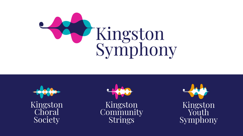
The Kingston Symphony Logomark is based on the visual representation of soundwaves. The soundwaves and colours blend together, symbolic of the symphony instrument voices creating music. The curl at the beginning of the wave is taken from the Kingston Symphony font, and is intended to represent the scroll on stringed instruments. The hidden stringed instrument in the soundwaves is intended to be “discovered” by the viewer, thereby making the logomark easier to remember. The font chosen is a nod to the history of the symphony, as well as their classic period pieces, and contrasts well with the more modern logomark. The colours were chosen to imply the excitement and vibrancy of the live music experience.
The family of brands have similar elements to tie them together as well as unique shapes to differentiate them. The Community Strings logomark contains the stringed instrument wave with a different soundwave and introduces the gold colour. The Kingston Youth Symphony contains the stringed instrument as well as a more playful gold wave to represent the younger musicians. The Kingston Choral Society uses two vocal waves without the hidden stringed instrument. The Kingston Symphony Volunteers logo uses the main symphony logo as it serves the whole organization.
See the full press release on the Kingston Symphony website.